Spring Color Combinations
Blue jeans and a basic tee, tank, or blouse is the unofficial dress code of the decade; maybe even the century. This recipe pairs the traditional light-to-dark wash denim tone with neutral tops and scuffed white sneakers. Of course, jeans and a simple top will never go out of style. Yet, as the birds start chirping and the spring season sends its sunshine toward campus, an opportunity to experiment with colors cannot go unnoticed. It is a chance to add more tones to your rotation, beyond the classic blue denim as the only pop of color (which practically counts as a “neutral” at this point). In order to challenge the comfort zone of jeans and a white or black top, here are a few spring color combinations to try.
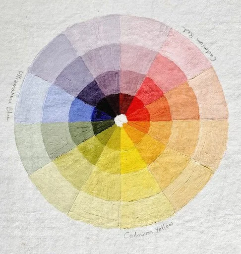
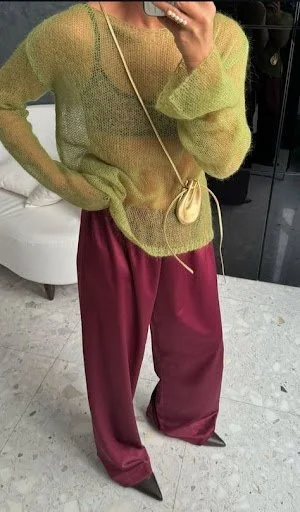
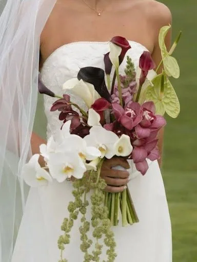
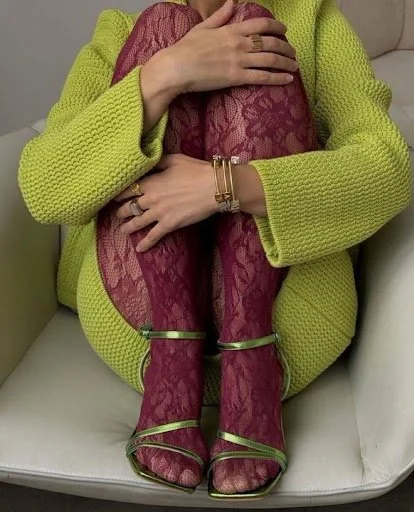
Photo from PinterestThe color combo of burgundy and chartreuse is all the rage in the wedding world. This trendy pairing is a less traditional bridal theme that mixes the vibrant, bright color of chartreuse with a deep, moody color of burgundy. To take you back to the kindergarten art classroom, the color wheel suggests that these tones are opposites—warm versus cool. Therefore, they cultivate a complementary effect. High contrast evokes a maximalist-but-cultured feeling. Although burgundy and chartreuse may feel “overdone” by next year’s wedding season, the two colors are a truly unexpected pairing that inspires a unique and artistic approach—manifested in calla lily floral arrangements, eccentric bridesmaid dresses, and now, your casual spring closet.
Although the colors may at first feel off-putting together, the funkiness is what makes it fashionable. Fashion is a fusion of creativity and functionality—so don’t be afraid to wear bold colors and mix and match. If you want to start small, you can focus on the details—like burgundy colored nails and an acrylic chartreuse claw clip. Burgundy, velvet ballet flats and chartreuse buttons on your grey cardigan.
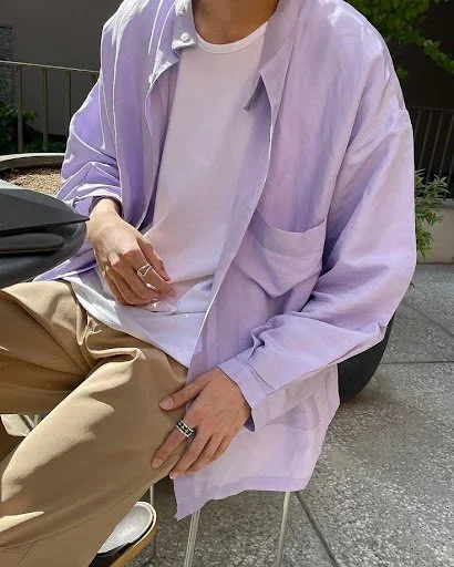
Left, Center, RightThree months ago, Pantone announced its 2026 color of the year as PANTONE 11-4201 Cloud Dancer: a muted, off-white tone. Some reacted with backlash to this color choice, feeling as though the promotion of a color-less shade was disappointing. However, ivory or cream tones like Cloud Dancer offer a warmer base than a pure white found in most basic tees. At times, cream tones can be hard to find consistently, as manufacturers most often produce heather greys or brilliant whites. The off-white can be tricky, because if it’s too yellow, it can clash with other white details, and if it's too grey, it may appear dreary. When styled well, it looks sophisticated, summery, and breathable. A color that pairs especially well with ivory tones is light purple, or lavender, which emphasizes the peaceful, floral, and natural feel of the understated shade.
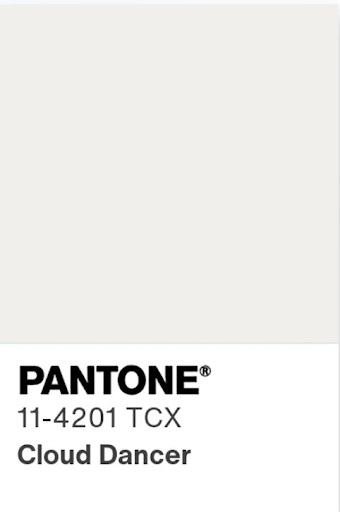
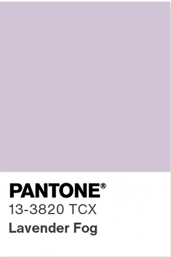
Cloud Dancer, Lavender FogIn recent years, purple has slowly dropped off most clothing racks, while colors like sage green and butter yellow have found their way to the frontlines of online storefronts and window displays. Purple is a color associated with rarity and power—from the affluence of royal purple fabrics throughout history, to the witchy energy of amethyst crystals and tapestries. Lighter tones, such as lavender and lilac, carry a similar depth and mystical energy, but with a lighter grace. Its underrated aura draws attention without feeling too loud.
This spring, try pairing cream colored jeans with a satin purple tank. A lavender, linen button-down with off-white linen shorts. A silky ivory skirt. A light purple bandana accessory tied to your belt loops or styled as a headband. A lavender pedicure with cream colored sandals, or vice versa.
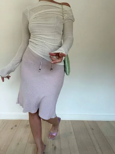
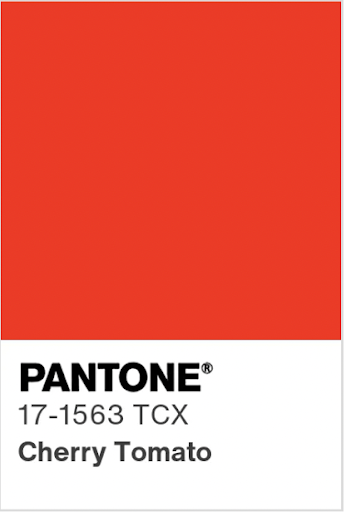
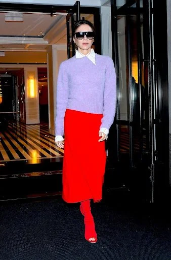
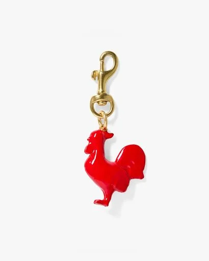
Cherry TomatoThe tomato-toned red and lavender are a distant relative to the chartreuse-burgundy marriage—maybe cousins. Although these two tones are not opposites, their different undertones provide a bright contrast. The orange undertones of the red paired with the cool-toned light purple create an artistic combination with a modern, fresh feel. These colors aren’t typically found together in nature—unless you picture a ladybug perched on a lavender flower—and this is what makes the combo feel foreign at first, yet pleasing to the eye. Like the ladybug visual, a pop of red can be subtle—like patterned socks, pocket stitching, or as small as a red charm on your bracelet, such as one from Clare V.
Left, RightFor those who have watched the infamous The Devil Wears Prada, most can distinctly recall Miranda Priestly's speech about Andrea Sachs’ “cerulean” colored sweater. In the movie, Andy pairs a cerulean blue sweater with a light brown and grey argyle skirt. After getting reprimanded for her ignorance to the color’s history and significance, Andy realizes there is value behind color choices that she never knew of.
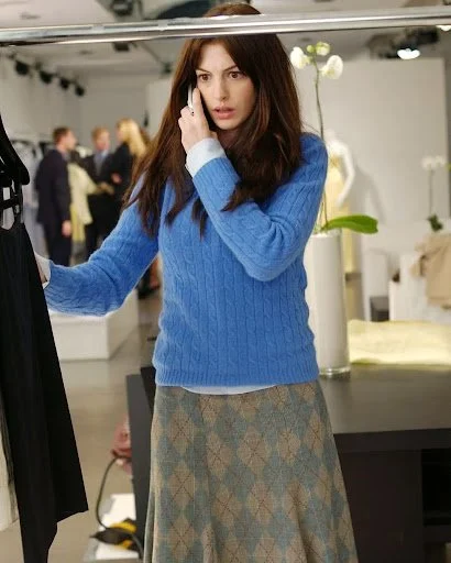
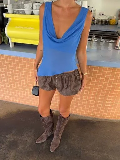
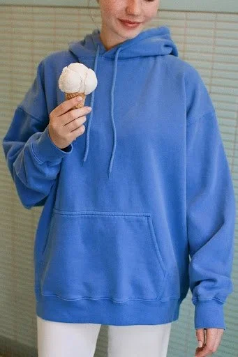
Photo from Harper's BazaarThis spring, a trendy color combo that is rising is a new take on Andy’s blue and brown outfit. Tones like cerulean, and even brighter shades of electric blue are vivid and rich in color. The bright blue demands attention—so when paired with a mocha shade of brown that is not particularly eye-catching, the tones are another unexpected duo. Although electric blue may be reminiscent of iMessage text bubbles, the cobalt-y, indigo-esque shade is reimagining itself as a fashion statement, and rivals the safe, familiar tone of navy blue. Although it spiked in popularity in 2025 via trendy storefronts like Brandy Melville, bright blue is here to stay this spring. The pairing of bright blue with brown makes the blue tone feel less overdone and more eloquent and intentional.
Brown goes with just about everything. Specifically, mocha shades provide a more stylistic, intellectual connotation than a khaki or taupe shade that feels associated with work uniforms. Pantone’s “Mocha Mousse” was the official Color of the Year in 2025—this year, slightly darker tones, like Pantone’s “Tiramisu,” will continue circulating and evolving, but ultimately never get old or overdone.
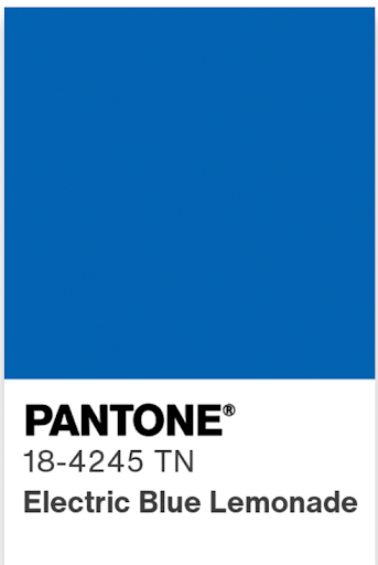
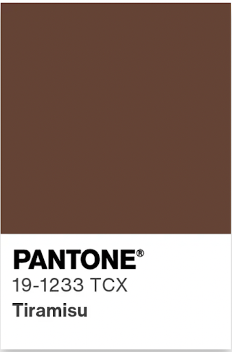
Electric Blue Lemonade, TiramisuThis spring, try out bright blue and brown stripes. Brown loafers and an electric blue hoodie. To reverse the blue jeans and neutral top dresscode, try out brown jeans and a crisp blue tee.
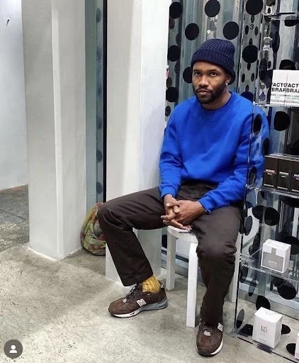
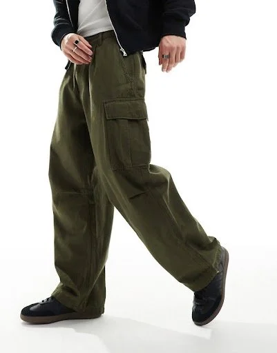
Left, Center, RightLast but not least, these two neighboring colors too often compete. This spring, it’s time for them to make amends. Blue and green are cut from the same cloth, yet so often, people feel forced to choose one or the other. To pair these tones together, a formula of light and dark allows more contrast—and intentional coexistence. If you haven’t yet noticed, baby blue is resurfacing this spring. A slightly icier, angstier blue—icy blue—pairs even better with tones of green, as it is slightly more grey. To build off this burgeoning trend of light blue pieces, a dark, army-esque green can be added to tease blue with another modern, color-block effect (not unlike the previously mentioned color combos).
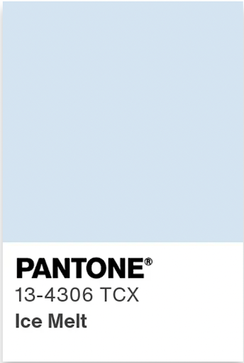
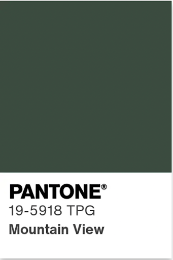
Ice Melt, Mountain ViewThe ashy-ness of a cargo-inspired green plays with the iciness of a light blue, as if both are slightly off the beaten path—but in a cool, distressed way. This color dynamic says pastel, yet industrial. It’s perhaps even a fusion of femininity and masculinity. Bonus points if you style these colors with various textures, like suede, canvas, and velvety textures.